beautiful drink. beautiful life
martini
The ‘BEAUTIFUL’ experience
This was a pitch for Martini (We won it but frustratingly the agency couldn’t actually take on the account because of a conflict of interest) - But the idea was beautiful. Quit literally.
Inspired by a research trip to Milan where we soaked up Aperitivo culture, we concluded the creative answer laid in the rituals around the serve. It’d have to be so spectacular in contemporary look and taste, for it to create true brand differentiation as well shift the perception that Martini belonged in the 70/80s.
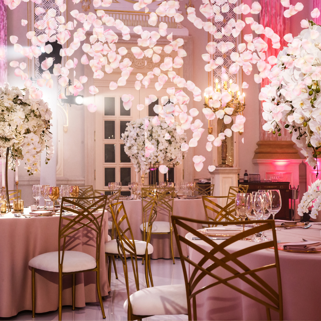
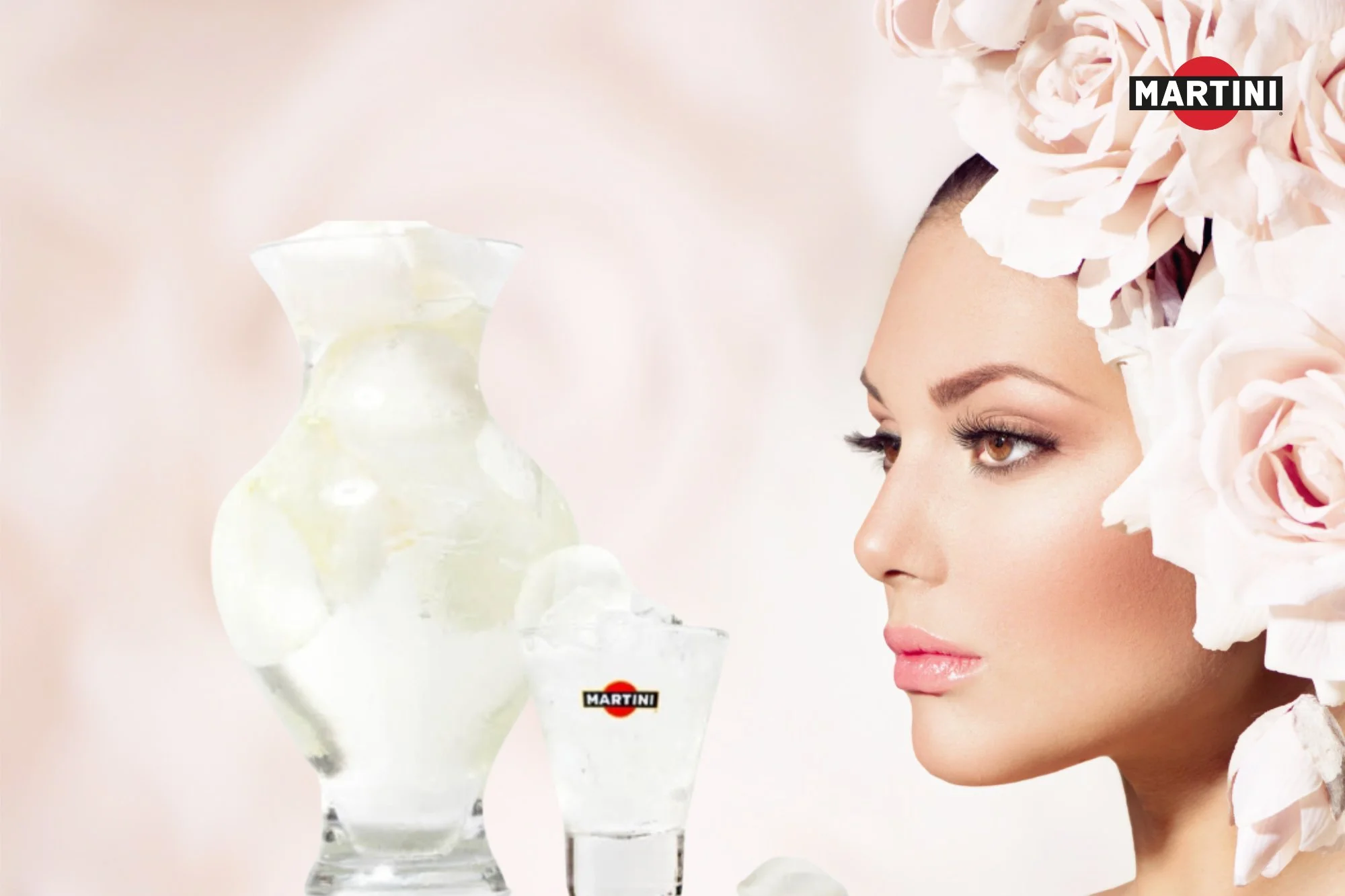
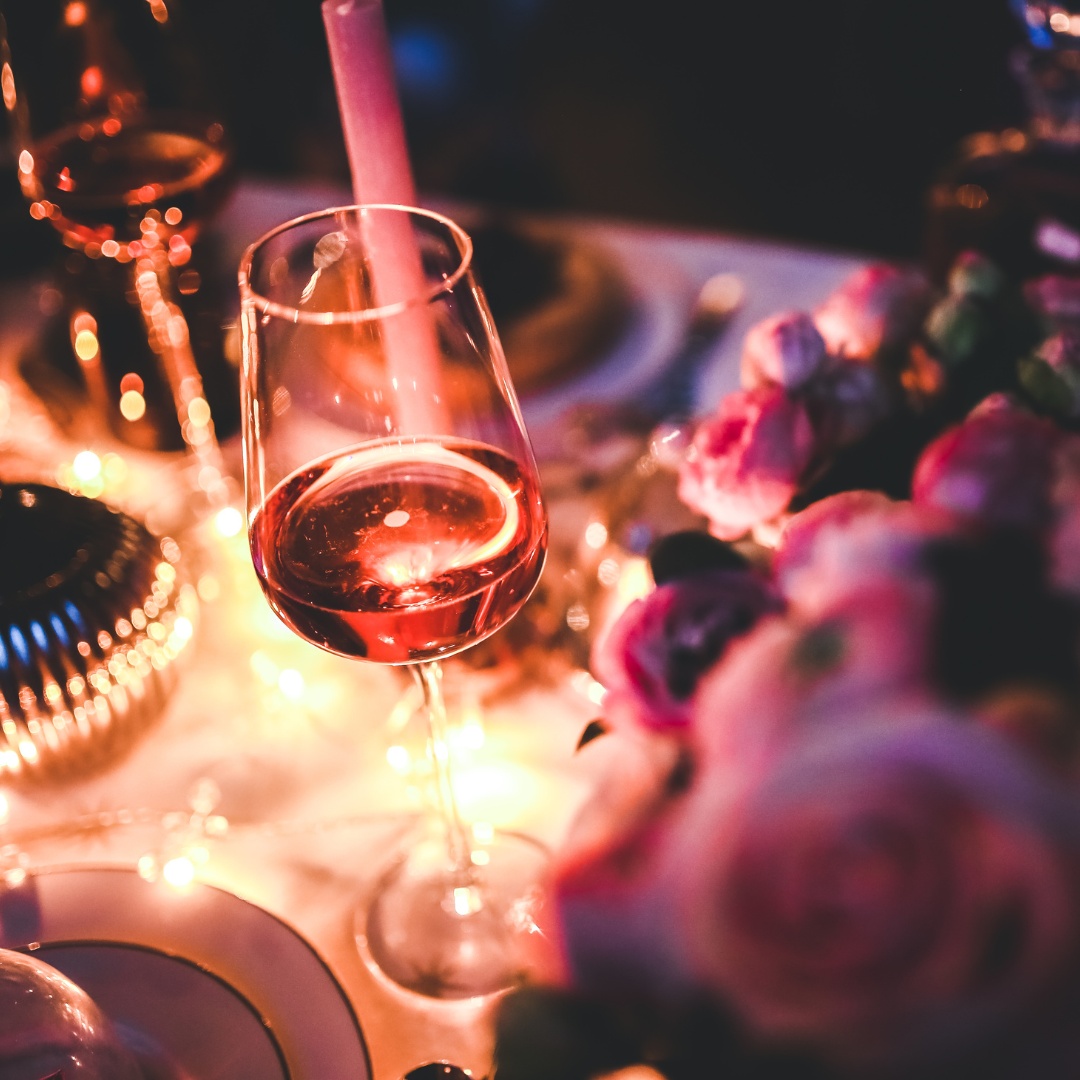
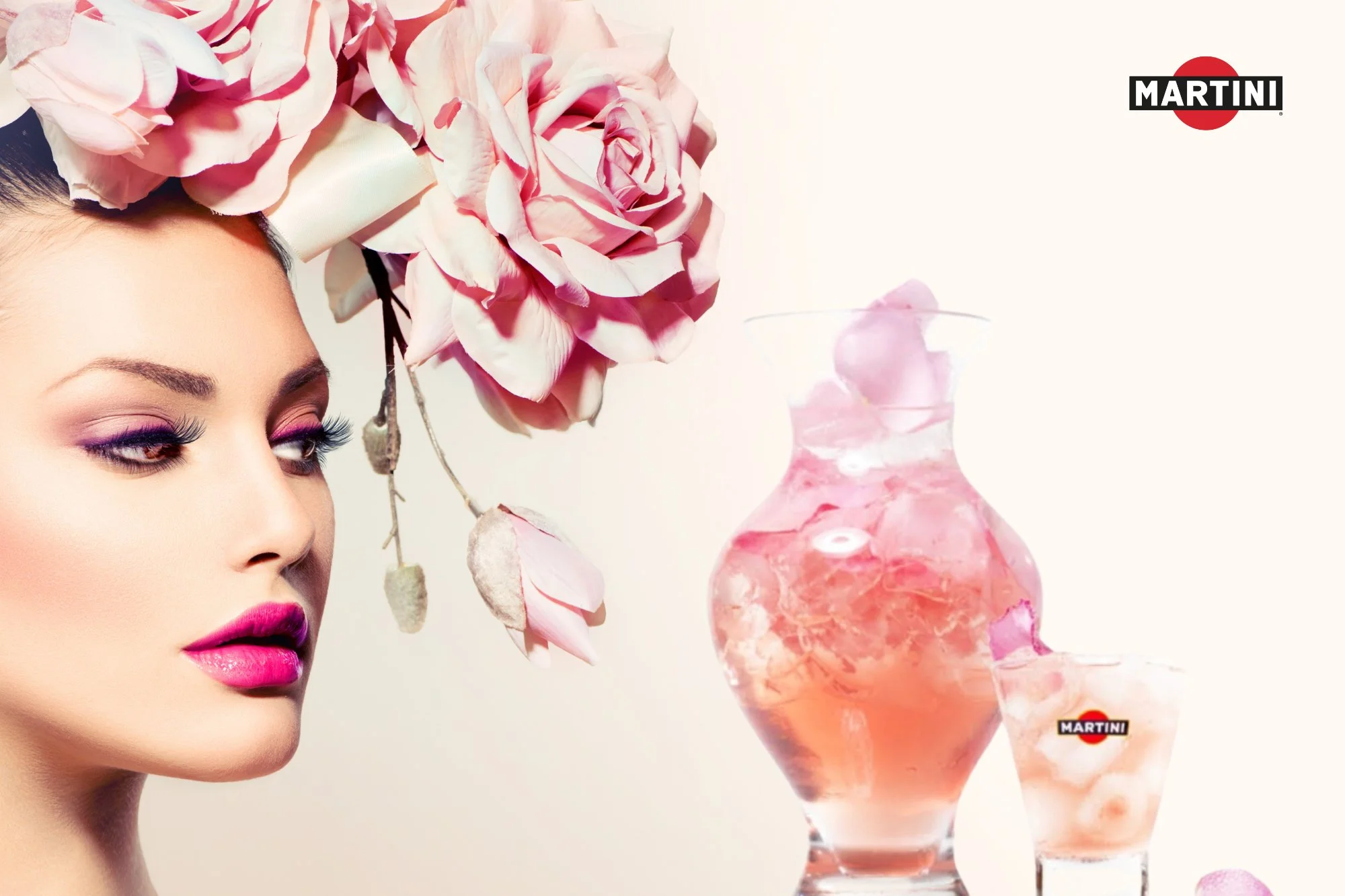
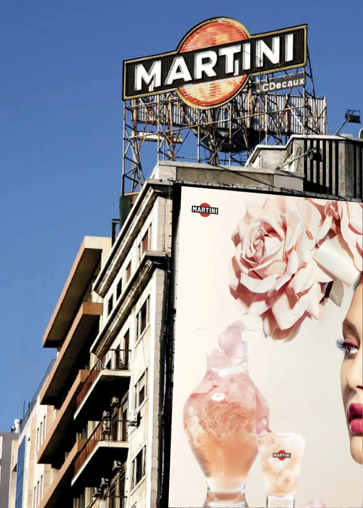
Our answer became ‘The Beautiful serve’. Equal parts Martini (Bianco or Rosato) and Tonic serve over ice served in carafes designed like Italian flower vases filled with pink rose petals for the Rosato and white for the Bianco. The on-trade experience would be spectacular and make sure anyone ordering a pitcher of Pimm’s would look a little pedestrian.
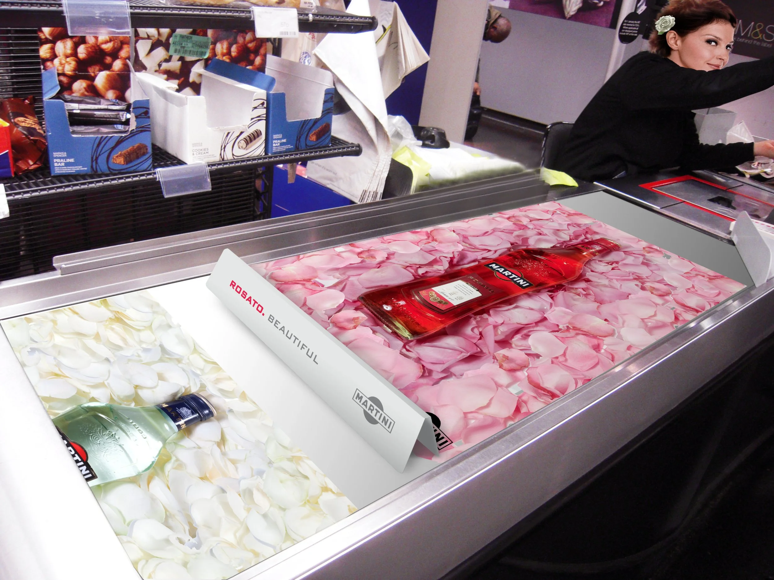
The idea of ‘Beautiful’ would then be brought to life in off-trade where we’d see collaborations with beauty brands where the colour scheme of pink and white roses would connect to lifestyle content of a ‘beautiful life’.
We’d create ‘beautiful’ VIP roof top bar experiences with rose petal drops. In-store we’d have special carry bags containing bunches of roses with each purchase. All beautiful and of course, extremely Instagrammable.
Role: Art Director
Agency: The Bank